
Pi Journal - The brand of Vietnam Institute of Mathematics' magazine
- Dec 7, 2025
- 2 min read
Quite “involved” in education, JK Advisory (the new name of G’Brand) was commissioned by Professor Ngô Bảo Châu and the Vietnam Institute of Mathematics to build the brand for a Mathematics Journal in 2017! The brand-positioning story was straightforward; the challenge lay mostly in the name and the brand identity. The name Pi Journal was proposed by our team and approved immediately. After that, the creative team began working on the Pi Journal logo. Although the symbol “Pi” is static - a constant with a specific value - it is also dynamic because Pi is an irrational number, meaning it contains an infinite, non-repeating sequence of decimal digits.
Our Creative Director designed this brand logo, bringing movement into the “Pi” symbol. Not only that, the logo also features a flexible color system across different covers, adding aesthetic value while expressing the liveliness and fascination of this journal. For the first manchette, we drew inspiration from the origin of the Pi symbol, derived from the Greek word for “perimeter.” The logo and manchette in this first design delighted the Vietnam Institute of Mathematics. It gave the inaugural issue - as well as several subsequent ones - an impressive, artful look, far from the stiffness people often associate with mathematics.
For JK Advisory, mathematics is also a form of art - that’s truly how we see it.
⸻
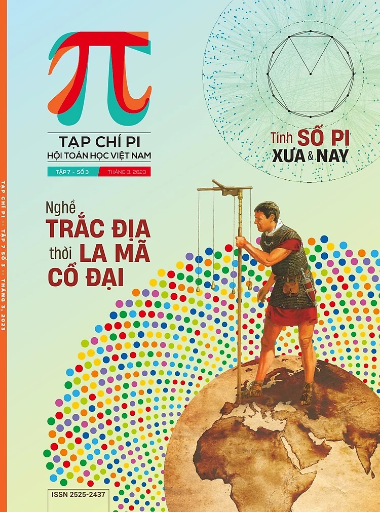
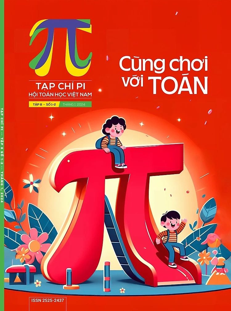
Khá "dính líu" đến giáo dục, JK Advisory (tên gọi mới của G'Brand) đã được Giáo sư Ngô Bảo Châu và Viện Toán học Việt Nam đặt hàng: xây dựng thương hiệu cho Tạp chí Toán học từ năm 2017! Câu chuyện định vị thương hiệu thì khá rõ ràng, chỉ là cái tên và hình ảnh thương hiệu. Cái tên Pi Journal do chúng tôi đề xuất đã được duyệt ngay. Sau đó, team sáng tạo bắt đầu với logo Pi Journal. Chữ "Pi" tuy tĩnh - là một hằng số với giá trị cụ thể - mà lại động bởi nó là một số vô tỉ, có nghĩa là nó có vô số chữ số thập phân không lặp lại theo chu kì.
Giám đốc Sáng tạo của chúng tôi đã trực tiếp sáng tạo logo thương hiệu này với chữ "Pi" chuyển động. Không những thế, nó còn có ứng dụng màu linh hoạt trên từng nền bìa để tạo giá trị thẩm mĩ đồng thời thể hiện sự sinh động và thú vị của cuốn tạp chí này. Với manchette đầu tiên, chúng tôi lấy cảm hứng từ ký hiệu của chữ "Pi" bắt nguồn từ chữ cái Hy Lạp "perimeter" (chu vi). Và logo cùng manchette tạp chí với thiết kế đầu tiên khiến cho Viện Toán Học Việt Nam vô cùng ưng ý. Đây là số đầu tiên cùng một vài số sau này của tạp chí, rất ấn tượng, thẩm mĩ chứ không khô cứng như người ta nghĩ về toán học.
Với JK Advisory, toán học cũng là một bộ môn nghệ thuật, chúng mình nghĩ như thế!


Comments